Website UX Case Study
Airbnb
Users faced difficulties in comparing multiple properties, leading to frustration and an inefficient decision-making process. The lack of a comparison tool on the Airbnb website resulted in excessive memory load and time-consuming tasks for users.

Problem Statement
Project Overview
This project involved a comprehensive UX research study on the Airbnb website, aimed at identifying issues, challenges, and areas of improvement to enhance user experience. The research team conducted both primary and secondary research, including competitive analysis and user interviews, to gather insights and propose solutions.
Methodology
Competitive Analysis
Research Interview
User Persona & Journey Map
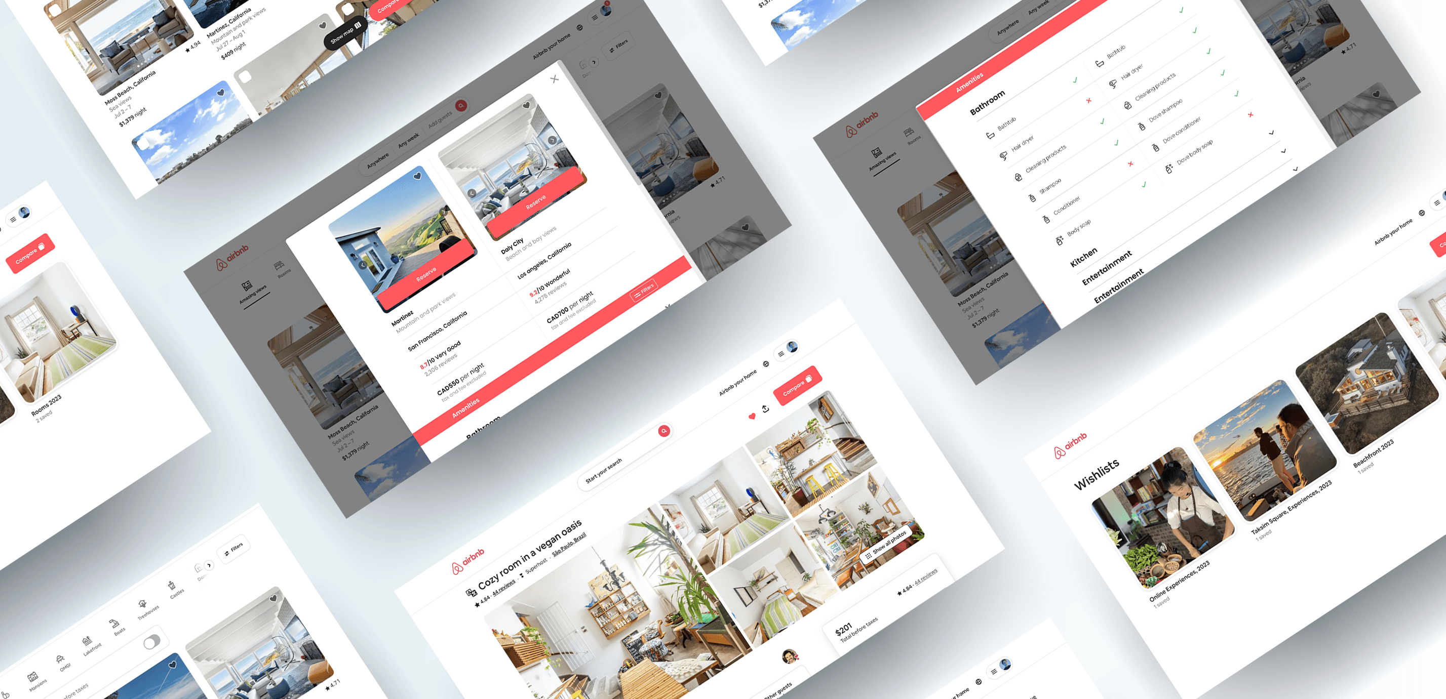
Based on our research findings, our team recommended a "comparison tool" to reduce browsing time and improve user efficiency on Airbnb's website. Key features include revised filters (price, amenities, location), flexibility to compare property features, viewing multiple properties on a single screen, and decreased memory load for users.
Proposed Solution


User Research
Wireframes
Competitive Analysis
User Interviews
Usability Testing
Problem Solution
Heuristic Evaluation
User Persona
My Role
Project Timeline
Research Phase
A detailed comparison of Airbnb with it's competitors, Booking.com and VRBO, was conducted. This analysis looked at business goals, user goals, usability heuristics, and SWOT analysis to identify areas where Airbnb could improve.
Our team decided to screen participants for the Airbnb research interviews. We created a screener to identify ideal participants. The interviews aimed to gather direct user feedback to validate assumptions, understand pain points, and uncover positive and negative elements of the Airbnb website. This primary research method provided deep insights into user experiences. We interviewed 8 people of varying demographics, ensured consent forms were signed, and maintained confidentiality.
Qualitative Research
Key Insights Derived
“We want to be distinct, memorable, and timeless”
VRBO wants families to travel better together. We believe in family connection. We need each other now more than ever, and we all want more quality time with the people we love.

“Focus on community, authenticity, and inclusivity”
Airbnb wants to provide travellers with affordable and unique accommodations that offer a more local and authentic experience.

“Respect, Community, and Integrity”
Booking.com offers five primary value propositions: convenience, accessibility, cost reduction, risk reduction, and brand/status.

User Persona
Define Phase
Enjoys cooking and baking
Frequent traveler
Organised
Personality
Interests
Likes to travel frequently
Exploring new places and cultures
Hosting and cooking for friends and family
Cooking meals herself while traveling
Engaging in outdoor activities like hiking
Motivations
Feeling at home in a new environment
Value for money in accommodation choices
Pursuing higher education in a new country
Creating memorable experiences while traveling
Needs
Pet-friendly accommodation with a backyard
Accommodation close to college and Downtown Toronto
Budget-friendly options with transparent pricing
Detailed property features
Flexibility to compare specific property details
Spacious kitchen for cooking
Clear communication with hosts for safety and comfort
Aria Malik
Age
Education
Status
Occupation
Location
26
UX Design
Single
Student
Canada

Journey Map
Task Flow

Existing Layout


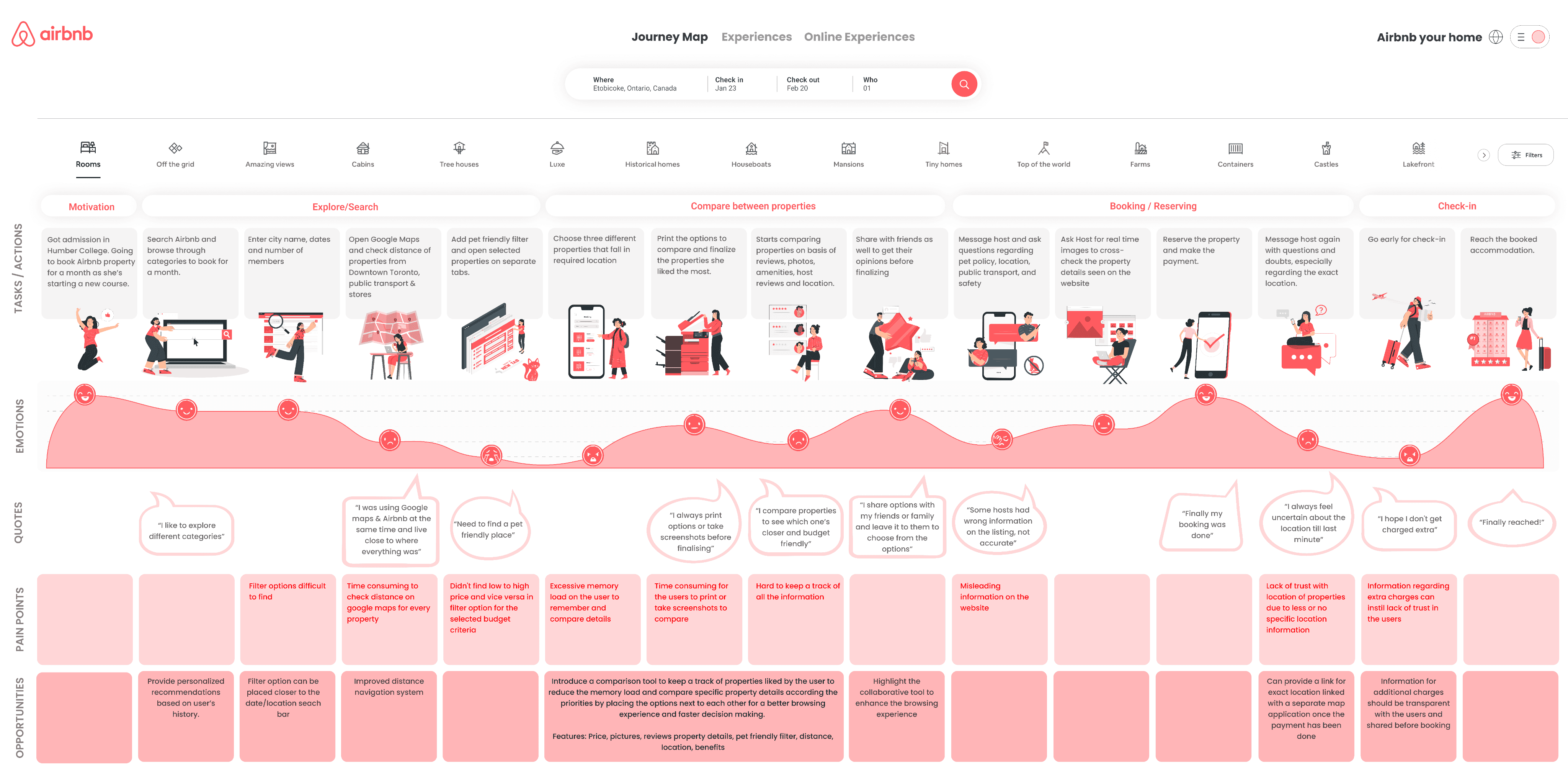
“I compare properties to see which one’s closer and budget friendly”
“I like to explore different
categories”
“I share options with my
friends or family and leave it to them to choose from the options”
“I always print options or take screenshots before finalizing”
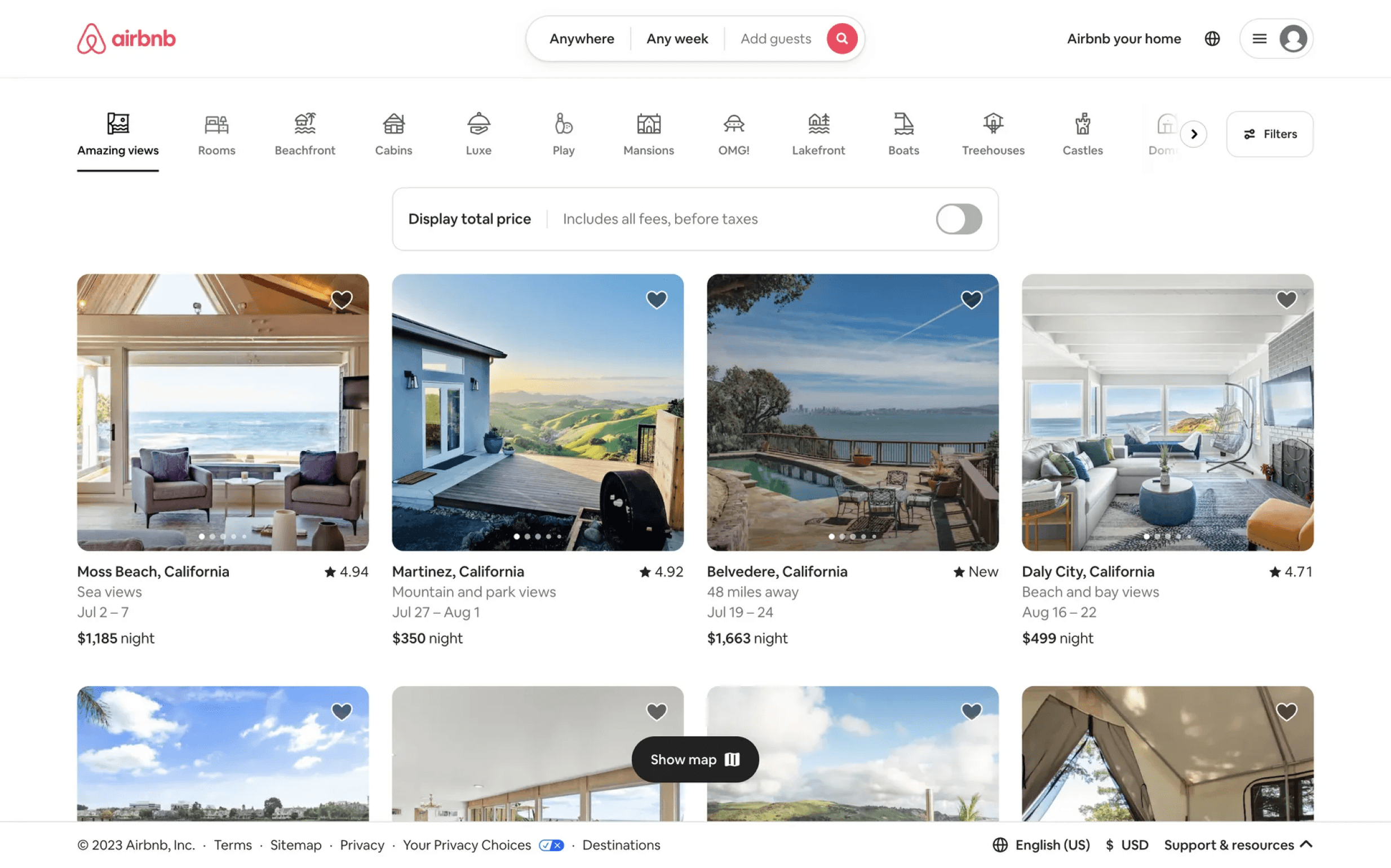
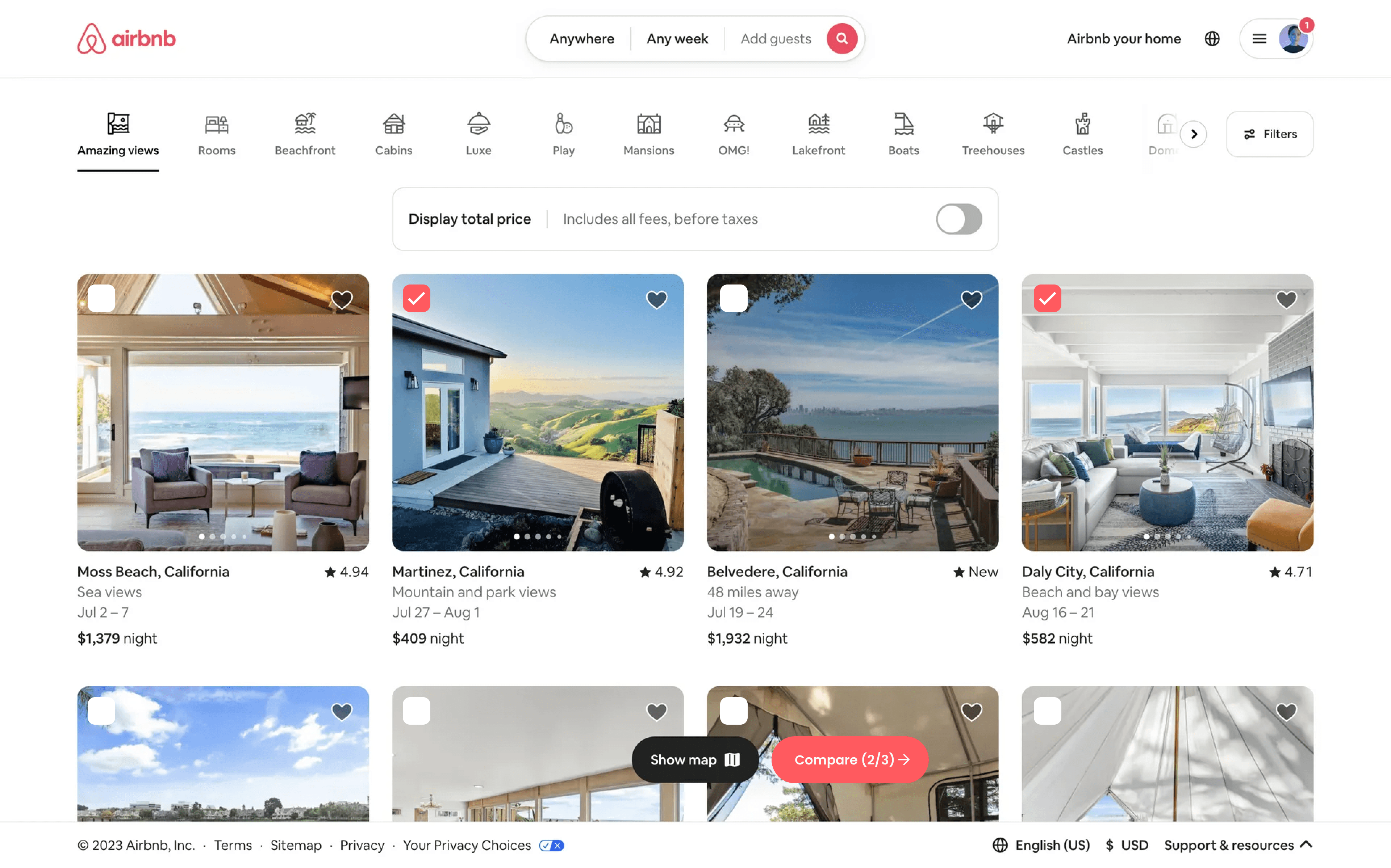
This is the current homepage layout of their website, lacking any feature or tool for property comparison. To compare properties side by side, users may rely on taking screenshots, share property options or print the listings.
Proposed Wireframes
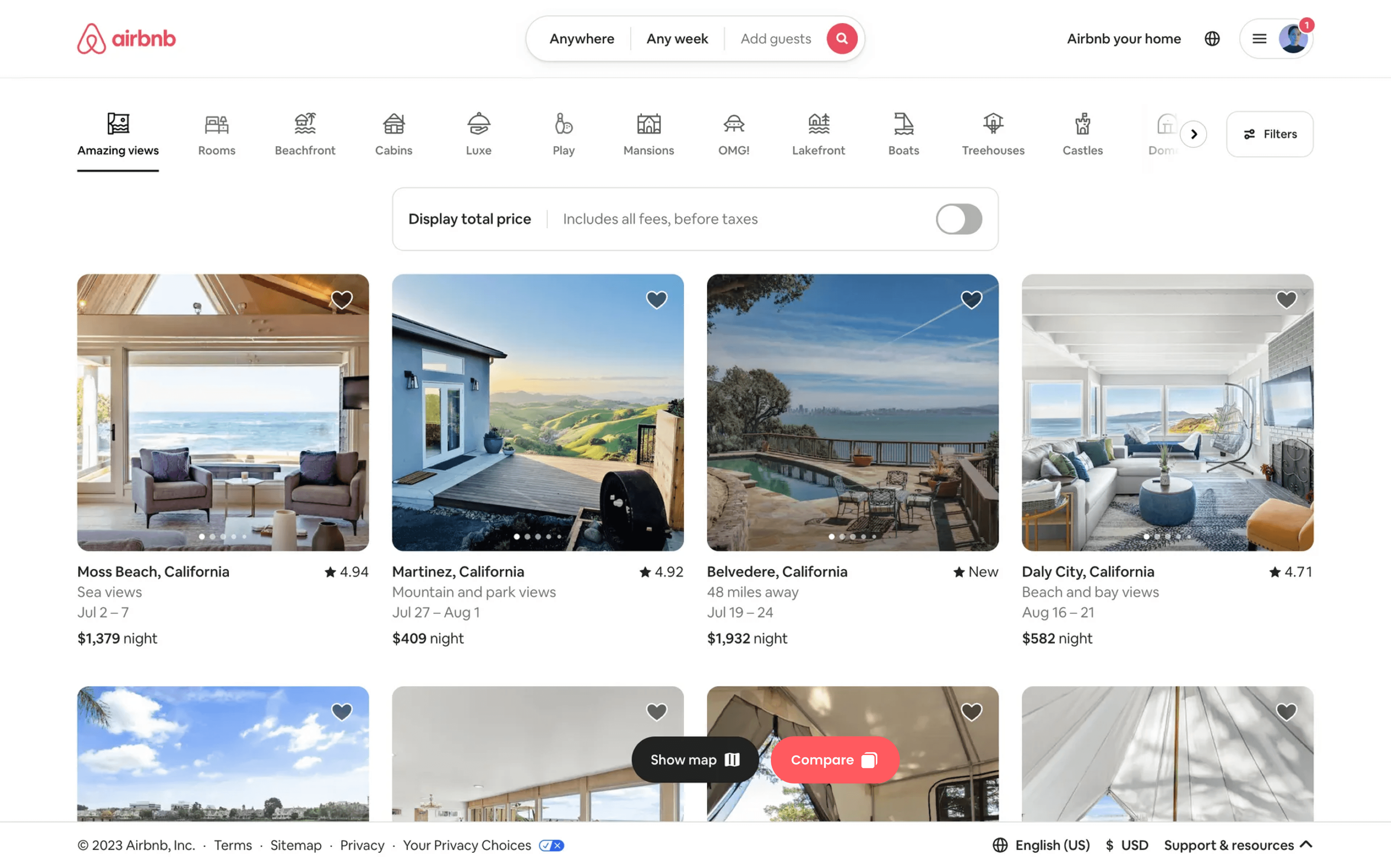
The proposed layout has a new comparison tool beside the map button at the bottom for users to select up to three properties of their choice making it easier for them to compare on the same page.


Understanding and addressing user pain points leads to solutions that genuinely enhance the user experience.

Learnings
Implementing straightforward solutions, like a comparison tool, can significantly improve user satisfaction and decision-making.

Working closely with a diverse team fosters creative ideas and leads to well-rounded solutions that address user needs from multiple perspectives.

Screener and Interview
1st
Week
2nd
Week
3rd
Week
4th
Week
5th
Week
6th
Week
7th
Week
8th
Week
9th
Week
10th
Week
11th
Week
12th
Week
Heuristic
Evaluation & Competitive Analysis
Gather Insights & Findings
UX Design
Secondary Research
User
Interviews
Wireframes & Prototype
Final Report
Gather Insights & Findings
Possible Solutions
UI Design
1
No Comparison Tool
User lacks the ability to view and compare multiple locations before making decision, and there is presently no quicker means to help this process, limiting the user's decision-making ease. This also creates excessive memory load on the user to remember and compare details.
2
Manual Filter Adjustments
Users need to manually adjust filters or individually click on each listing to access additional details.
3
Single-Category Search
No more than one category can be combined to look for options efficiently.



Interviewed
People
8
Explore More Projects
